Mar 25 2021
Free Gantt Charts Based on Time/Hours with Sparkline
I wanted to show the timeline of a disaster recovery plan on a Gantt style chart to make it look better than a boring list of tasks with start and end times, but I could not find any tool dealing with hours throughout a single day/24 hours.
Gantt software such as GanttProject also offer too many features that I don’t need just for a simple report. I decided to go for Sparkline function in Google Sheets: it is free, and remains quite easy even though it doesn’t work out of the box for hourly timelines. It is also available on Excel obviously.
What is Sparkline? Basically, Sparkline is a chart you embed in a single Excel (or other spreadsheet like Google Sheets) cell that gives you a trend. Bars chart are perfect for Gantt style timelines.
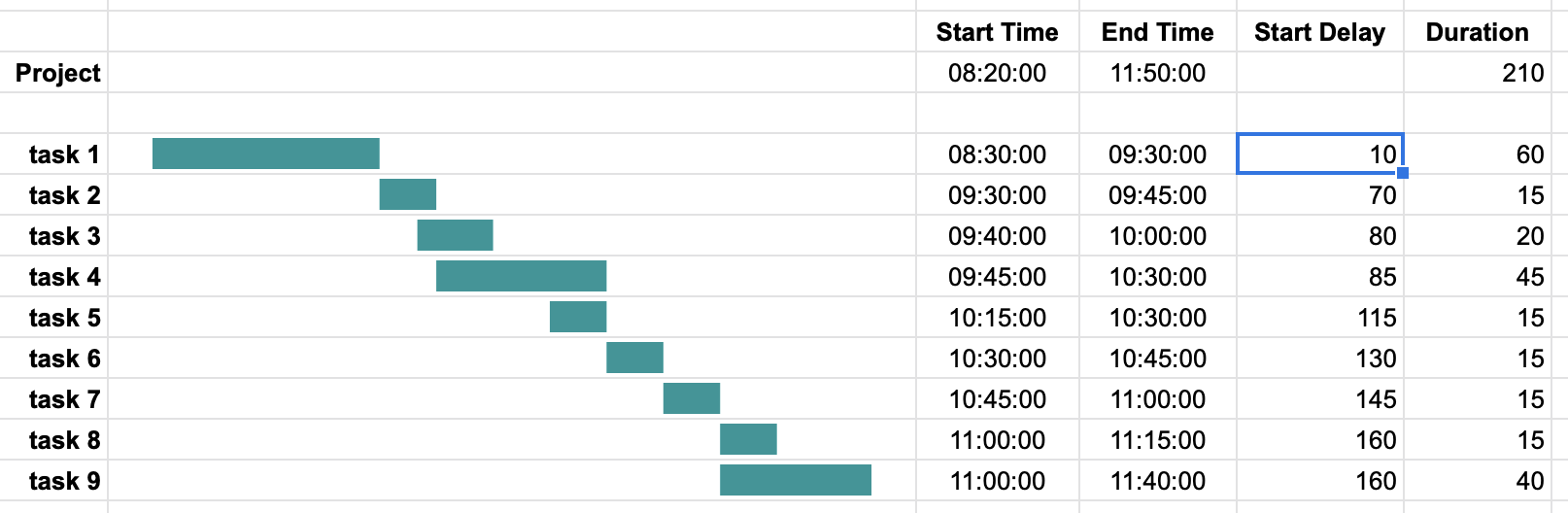
There is no min, and max works only for numbers in bars charts, this is why I created the 2 columns Start delay and Duration in minutes. Basic formulas based on the project and task start and end times fill them automatically
=HOUR(D5-$D$3)*60+MINUTE(D5-$D$3); Start delay
=HOUR(E5-D5)*60+MINUTE(E5-D5); Duration
Sparkline cells are built from these 2 values; The first bar is white to start the coloured bar at the right place. Max value is the actual project duration
=SPARKLINE(F5:G5,{"charttype","bar";"color1","white";"color2","#199698";"max",$G$3})
Could you please send me an example of the above file in Google Sheets? I would be very grateful! Thank you!
=SPARKLINE(F5:G5;{“charttype”\”bar”;”color1″\”white”;”color2″\”#199698″;”max”\$G$3})
instead , i use \ and work well tnx…